English Online Help Topic Settings
6.6.2.9 Settings
In the menu
Settings you can select, how the
graphic of the statistic should be displayed:
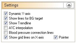
Dynamic Y-axis (for the level of the blood glucose values): SiDiary
defines the division dynamically (in steps of 50) up to highest tracked blood glucose value of the selected
time range. Otherwise the chart goes up to 400mg/dl fix (or 22mmol/l fix).
The colored lines for the target area are adjusted in the personal
settings in your therapy data (see the green and orange line).
The trend line is the thick blue line in the
line graph and shows the trend of the blood glucose level in the selected
period.
With the option A1C interpolation the
effect of your bolus insulin for the correction of too high blood glucose
values is considered, which makes the indication of the calculated A1C value
more accurate (for further information see also chapter Fehler! Textmarke nicht
definiert. Fehler! Verweisquelle konnte nicht
gefunden werden.).
If you select Blood pressure
connection lines, the upper value (systole) of the line graph for blood
pressure will be connected by a line with the lower value (diastole):
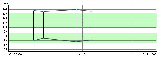
This type of display is also used in intensive care, because it makes a quick
rating of the amplitude trend possible (amplitude = the area between systole and
diastole).
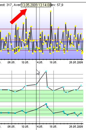
Pointer will give you a vertical line next to your
mouse cursor position to make it easier to see the exact position regarding
date and time: